Wednesday, September 28, 2016
Exquisite Corpse
Above is my exquisite corpse that was based off of the Business Frog sketch, I wanted to show that the frog is leaving work, which is why I put a city in the background. I chose to remove the cigar from the frog as I didn't think it would fit with my version.
Wednesday, September 21, 2016
Final Icon
Final Icon
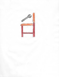
Above is my final icon. The inspiration for this came from two of my original sketches, when the sketches were critiqued in class, one of the suggestions I received was to combine two of my original sketches. Below are the two original sketches, the blue chair from the first sketch and the wrench from the second sketch were the aspects of both that I incorporated into the design of the final icon.
In terms of the color choices for the logo I chose blue as its a color that is peaceful and tranquil, which something that these custom made chairs will do for their customers. The Point of the wrench is to show that the customer will have a chair that is built to accommodate their needs. I also wanted the text to be as simple in appearance as well as color, the reasons for this was to prevent distraction from the rest of the logo.
Monday, September 12, 2016
Logo Comparison: Premiere Pro and Final Cut Pro


Above are the logos for two professional video editing software the one on the right is Adobe Premiere Pro and the one on the left is Apple Final Cut Pro. Both of these programs are aimed at professional video and film makers and make it possible to edit video clips in more advanced ways compared to very basic editor that are free and ship with some computers.
The Premiere Pro logo is quite simple and fits in well with the logo for all the other programs in adobe's creative cloud lineup. The color choice to me doesn't make a huge difference with this Icon as all Adobe Icons are very similar in terms of design. However this logo isn't successful in conveying what the program does, but this may not be Adobe's focus because they are targeting professional video creators/editors and these types of customers are likely to do a lot of research before buying an expensive video editing program and therefore will not need to know what the product is based on its logo.
The Final Cut Pro logo gives anyone the impression that its something video related and I think the use of the rainbow of colors gives the impression that you can adjust the video to make it look the way you want it to. I feel that Final cuts logo is successful because any one can look at know what the program relates to, you might not know its exact function just by looking at its icon.
Overall I feel that Final Cuts Logo is more successful as gives everyone an idea of what it does whereas Premiere Pro's logo is just one that matches inline with the rest of the Adobe Suite, though this is not a bad thing as it increases brand awareness if all icons are similar, but doesn't really tell us anything about the program's function and purpose.
Subscribe to:
Posts (Atom)


